Modern resume and CV templates for Google Docs™
Clean type, a little color and plenty of white space, in one column that still reads correctly in hiring software.
Templates
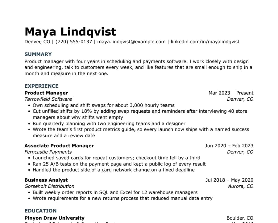
Modern Minimal
31/31 fields read
No lines or boxes, just white space and quiet slate-blue headings. Looks modern without anything a parser can trip on.
- 1 page
- Letter + A4
- Docs + Word
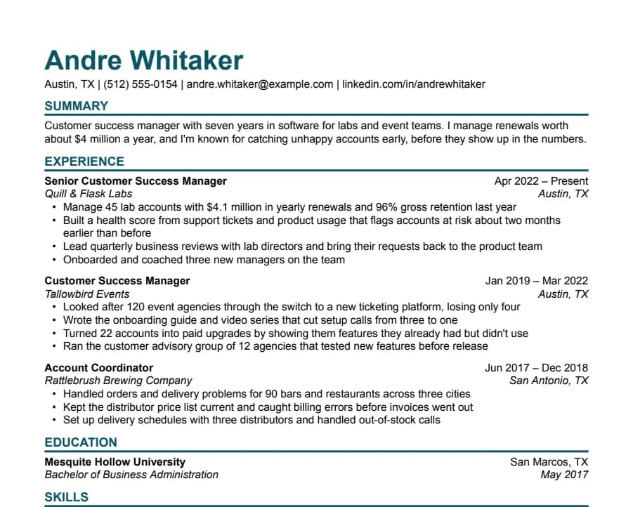
Modern Bold
33/33 fields read
A large teal name and heavy rules under each heading. Stands out in a stack of printouts and still reads cleanly in software.
- 1 page
- Letter + A4
- Docs + Word
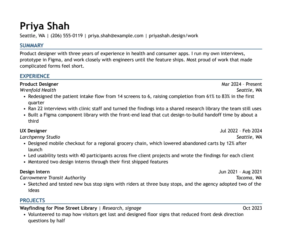
Modern Accent
35/35 fields read
One ink-blue accent on headings and rules, with a summary up top. Clean enough for any parser, with a little more personality.
- 1 page
- Letter + A4
- Docs + Word
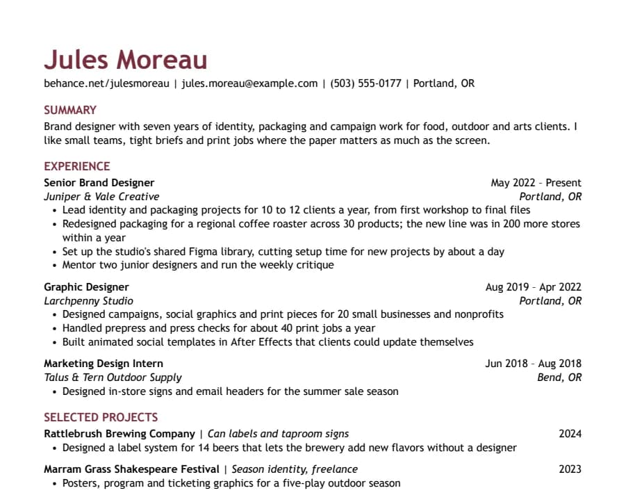
Creative
36/36 fields read
Color in the name and headings, your portfolio link first, and a section for selected projects. Personality without columns or graphics.
- 1 page
- Letter + A4
- Docs + Word
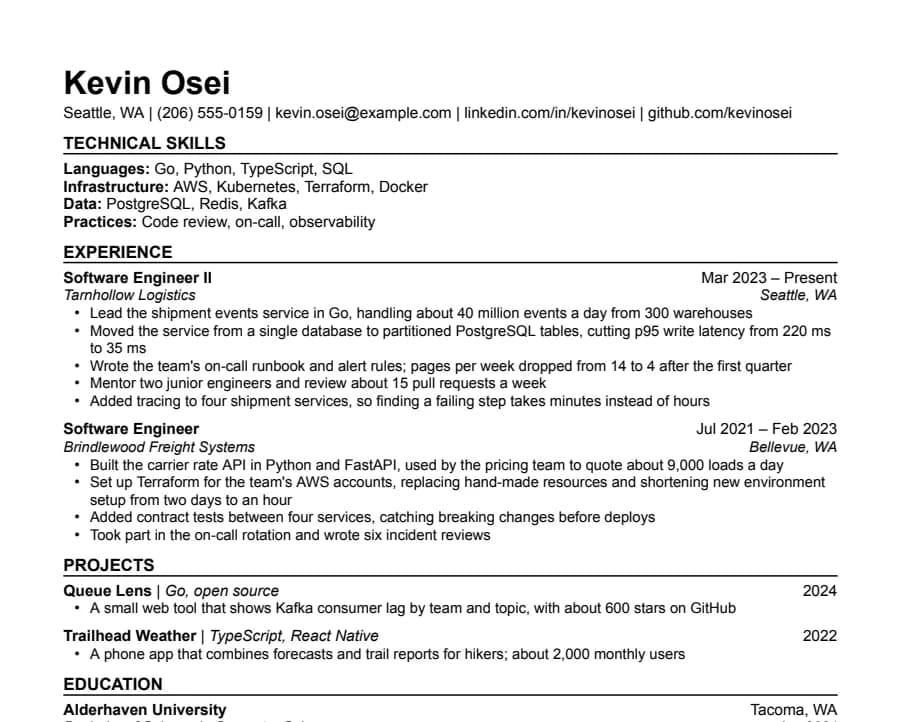
Technical
35/35 fields read
Grouped technical skills first, then experience and projects with the numbers engineers look for. A sans-serif cousin of Jake's.
- 1 page
- Letter + A4
- Docs + Word
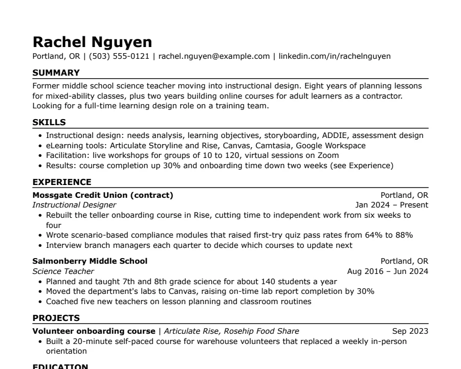
Skills-first
33/33 fields read
Summary and skills come before work history. Useful when you're changing careers or coming back after a gap.
- 1 page
- Letter + A4
- Docs + Word
What makes a resume look modern
Most of it is type and space, not decoration. A sans-serif font like Arial, Verdana or Trebuchet MS, a bigger name, color used only for the name or section headings, and enough white space between sections that the page doesn't look crowded. Short bullets that start with what you did help as much as any design choice.
What to skip
- Two columns and sidebars. They look modern in a preview, but many parsers read straight across the page and mix the columns together. Every template here is one column.
- Skill bars, stars and icons. Software can't read a graphic, and a bar showing “80% Excel” doesn't tell a recruiter anything. Write the skill out instead.
- Photos. Not expected in the US, UK or Canada, and some employers remove resumes with photos to avoid bias claims.
- Fonts Word doesn't have. A Google Font looks fine in Docs, then changes when someone opens your .docx. These templates only use fonts that come with both Google Docs and Word. More in our resume fonts guide.
Which one to pick
- Modern Minimal: no lines at all, slate-blue headings in Verdana. The quietest of the set.
- Modern Bold: a large teal name and heavy rules. Hard to miss in a stack of printouts.
- Modern Accent: navy headings with thin rules. A safe middle ground for most jobs.
- Creative: wine-red name and headings, portfolio link first. For design and marketing roles.
- Technical: grouped technical skills at the top, for software and IT.
- Skills-first: skills before work history, for career changes and gaps.
A modern CV for the UK or Europe
Every template here comes in A4 as well as US Letter. Switch the paper on the template page before you copy it. If you need two pages and a profile at the top, the International CV is built for that, and our CV templates page covers what to include.
Questions
- Are modern resume templates ATS-friendly?
- These are. Each one is a single column with real text, standard section names and no tables or graphics, and we publish what an open-source parser reads from every sample. Templates with sidebars, icons or text boxes are where problems usually start.
- Is color OK on a resume?
- Yes, in small amounts. One dark color for the name or headings looks deliberate and prints well in black and white. Keep the body text black so it stays easy to read.
- Is a two-column resume more modern?
- It can look that way, but it's riskier. Many parsers read a two-column page line by line straight across, so your job titles and dates can end up mixed with your skills. One column with good spacing gets the same clean look without the risk.