The best font and font size for a resume
Pick one that looks the same in Google Docs, in Word and in the PDF a recruiter opens.
Short answer
Five fonts that travel well
| Font | What it's like | Our templates using it |
|---|---|---|
| Arial | Neutral and very legible at small sizes. The safest choice if you're unsure. | Plain (parser read 33/33), Compact (parser read 36/36), International CV (parser read 63/63) |
| Georgia | A serif made for screens. Looks traditional without feeling cramped. | Classic (parser read 38/38), Student (parser read 35/35) |
| Times New Roman | Compact, so more fits on a page. Reads as formal, sometimes dated. | Jake's (parser read 46/46) |
| Trebuchet MS | A humanist sans with a bit of character. Good for creative and product roles. | Modern Accent (parser read 35/35) |
| Verdana | Very wide and open. Easy to read, but needs a smaller size to fit. | Skills-first (parser read 33/33) |
Every template above was downloaded from Google Docs as a PDF and read by the same open-source parser. All of them read cleanly, which is the point: for parsing, the font matters far less than the layout. Pick the one you like reading.
Why not Roboto, Lato or Garamond?
They look good in Google Docs, but they're Google Fonts, not system fonts. If you download a .docx and the recruiter's computer doesn't have the font, Word swaps in another one. Line lengths change, bullets wrap differently and your one-page resume can spill onto a second page. A PDF embeds the font, so it's safe there; the risk is any time someone opens your Word file.
Sizes
- Body text: 10.5 to 11 pt. Verdana runs large, so 10 pt is fine there.
- Section headings: 11 to 12 pt, bold. Capitals help a parser spot them.
- Your name: 18 to 22 pt, bold.
- Never below 10 pt to squeeze onto one page. Cut a line instead; the one-page guide shows the order to try things.
Templates by font
Five fonts, eight layouts, all in Google Docs and Word.
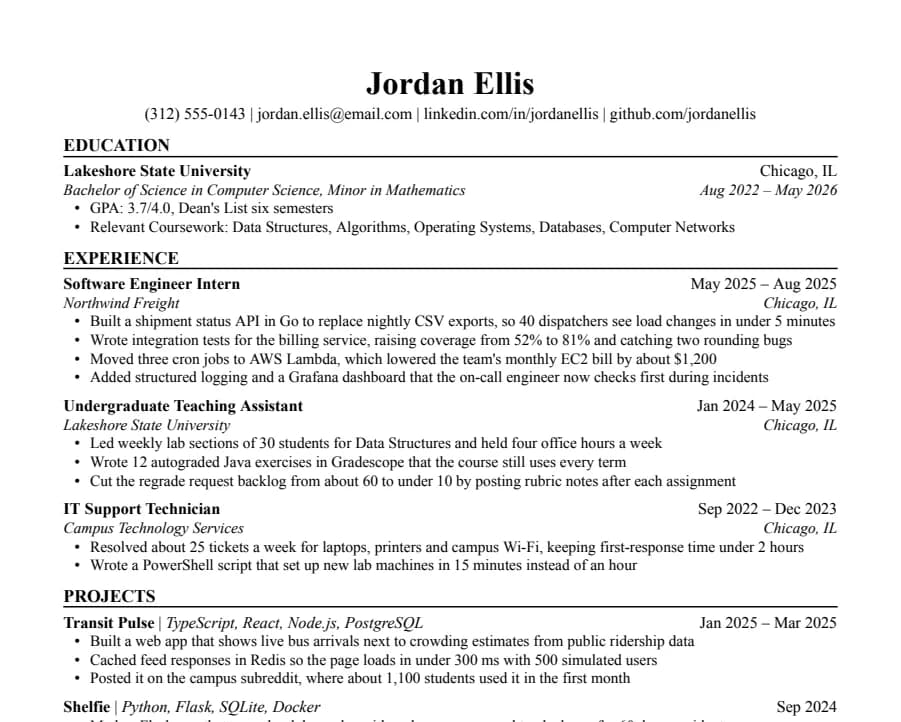
Jake's
46/46 fields readThe Jake's Resume layout rebuilt for Google Docs and Word. Dense, centered, made for tech internships and new-grad roles.
- 1 page
- Letter + A4
- Docs + Word
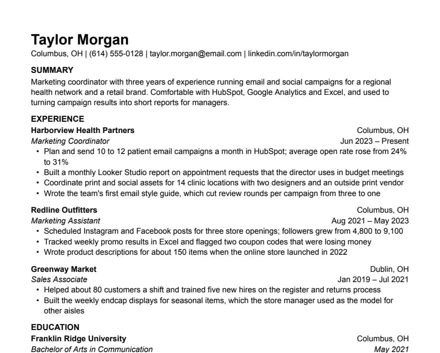
Plain
33/33 fields readNothing but text, left-aligned, in Arial. A safe default for any job when you don't want the layout to be noticed.
- 1 page
- Letter + A4
- Docs + Word
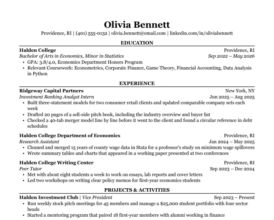
Classic
38/38 fields readSerif type, centered headings and education first. The look many university career offices recommend for finance, law and consulting.
- 1 page
- Letter + A4
- Docs + Word
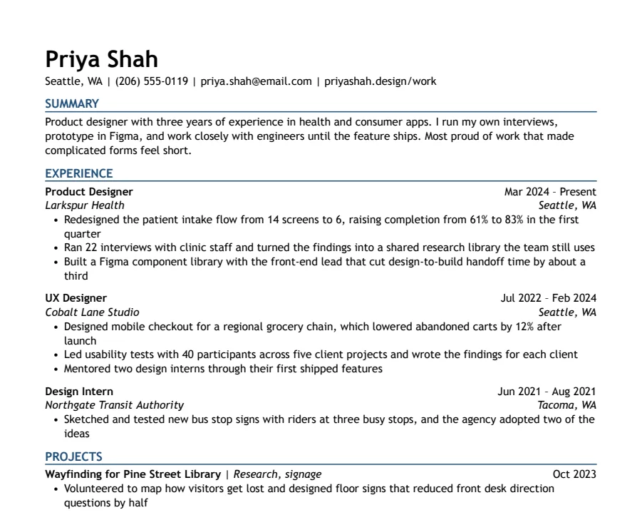
Modern Accent
35/35 fields readOne ink-blue accent on headings and rules, with a summary up top. Clean enough for any parser, with a little more personality.
- 1 page
- Letter + A4
- Docs + Word
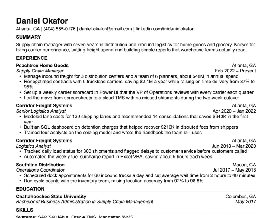
Compact
36/36 fields readHalf-inch margins and tight spacing for people with more experience than one page normally holds.
- 1 page
- Letter + A4
- Docs + Word
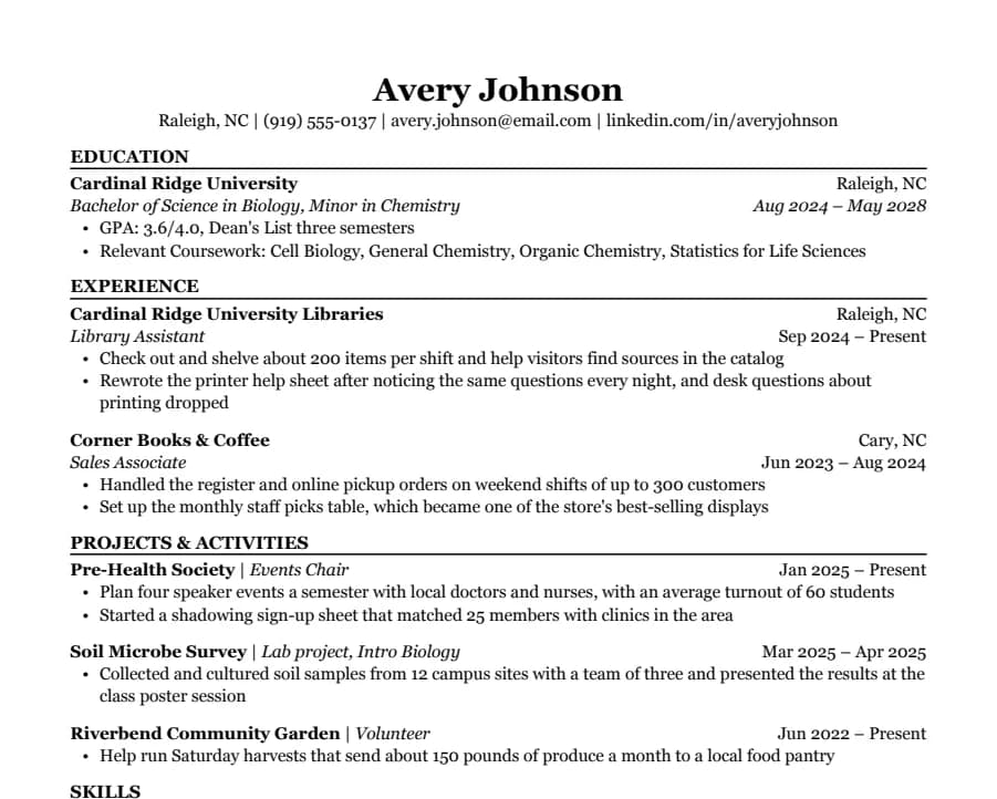
Student
35/35 fields readEducation first, then part-time jobs and a section for clubs, volunteering and class projects. Made for a first internship.
- 1 page
- Letter + A4
- Docs + Word
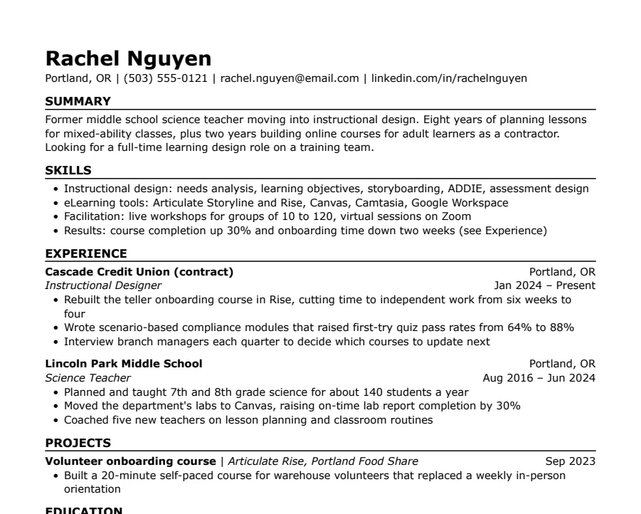
Skills-first
33/33 fields readSummary and skills come before work history. Useful when you're changing careers or coming back after a gap.
- 1 page
- Letter + A4
- Docs + Word
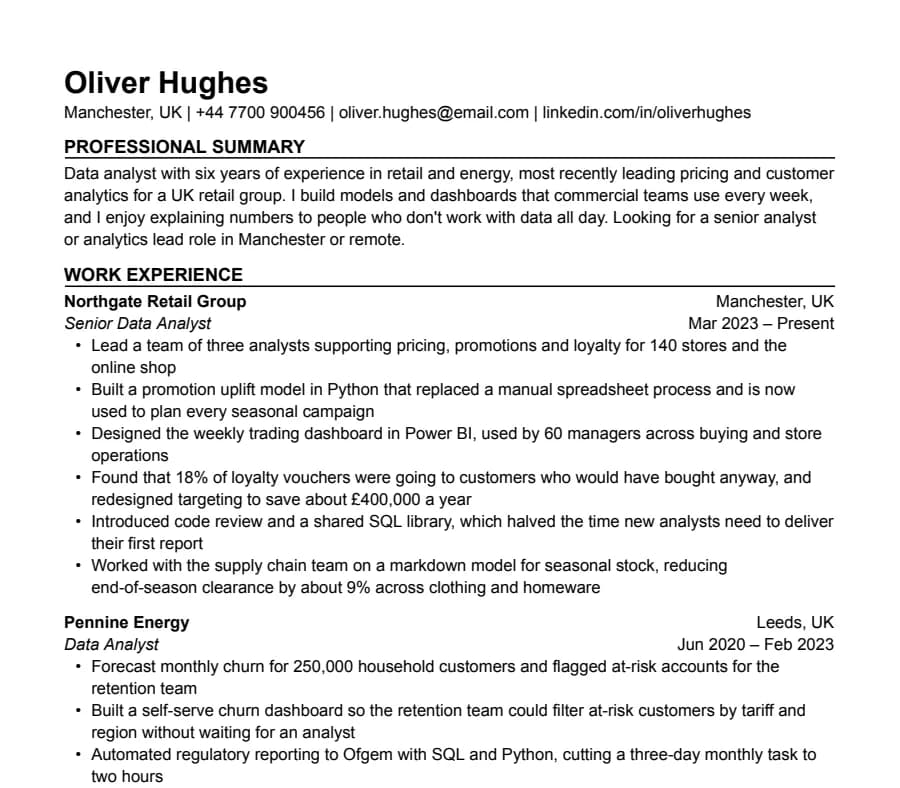
International CV
63/63 fields readA4, no photo, a professional summary at the top and room for two pages. Written the way UK and European employers expect a CV.
- Up to 2 pages
- Letter + A4
- Docs + Word
Questions
- What is the best font size for a resume?
- 10.5 to 11 pt for body text, 11 to 12 pt for section headings and 18 to 22 pt for your name.
- Is Times New Roman bad for a resume?
- No. It's compact and universally installed. Some people find it dated; if that worries you, Georgia gives a similar feel with more room.
- Serif or sans serif?
- Either. Serif fonts like Georgia feel more traditional, sans serif fonts like Arial feel more neutral. Neither affects how a parser reads the text.
- Can I use two fonts?
- Keep to one. Use size and bold for hierarchy. A second font rarely adds anything and doubles the chance of a substitution in Word.